Sunday, May 29, 2011
Boutonniere Love
I don't know if we will do any boutonnieres, since the groomsmen don't have jackets (it's August, after all). Maybe we'll just do one for John. Regardless, I love this boutonniere, mixing real flowers in with an awesome rose made from vintage sheet-music.
Also, it's simple, thin, and uncomplicated, unlike most boutonnieres I've ever encountered (think back to prom, and how you had to have your mom run inside and find more pins because the giant white rose didn't want to stay put on his jacket lapel).
Spotted on the Logan Cole blog.
O. Em. Gee.
 |
| Whaaaaaaaat this is seriously awesome. |
Spotted on StyleMePretty, photography by Jennefer Wilson. Kudos!
Sunday, May 22, 2011
Sprinkler Engagement Session
Spotted on OnceWed, Photography by Nancy Neil.
So adorable! I hope my own engagement photos are as awesome and full of love.
So adorable! I hope my own engagement photos are as awesome and full of love.
Saturday, May 21, 2011
Formal Invitations Part 3: RSVP Cards
I mentioned RSVPs already in a previous post (and had my French corrected before I made a fool of myself). So I won't rehash it too much. But I did have a second kind of RSVP card, for the jam session. We didn't send one with every invite, just to some of the key players. Hopefully we'll get a good group together and others will let us know if they have some interest in playing with us!
I made two different jam session RSVPs because I just couldn't decide between the two record players. They were both so pretty!
This is what I started with. I initially wanted to just edit out the text and use the book/roses for something in the invite suite, but I couldn't get it to look good.
I also designed two versions of the RSVP; one for single invitees and one for couples. Some people aren't aware of the convention that the names listed on the envelope are all that are invited. If your name is listed singly, than they aren't allowing you to bring a guest. I mentioned this to John, and he said he wasn't aware of that distinction. While some people know this from going to other weddings, others may be like John and unaware that they shouldn't tack on a +1 to their RSVP.
As I mentioned in the invite post, we have a super strict guest limit imposed by our venue. For a friend to bring a guest, an aunt or uncle would have to get axed, so we opted to include only engaged couples and those living together. Basically, we went with examples where we knew both people in the couple well, which in most cases meant they were living together/engaged/had been together for several years so we had gotten to know them anyway.
Hopefully this won't cause too many issues. It really was an attempt at inclusion, not exclusion: trying to bring together those that know us well and mean the most to us. If we don't know your girlfriend or boyfriend, chances are they won't know many of the other guests either.
I still have doubts. Should I have had a place to put a number on the multiple invites? How will people let me know if only one of them is coming? I know it will be fine and I can always just call somebody if I am confused, but I suppose a little stress about the RSVPs is normal, right? I just want to get a clear sense of who will be there!
Friday, May 20, 2011
Formal Invitations Part 2: Directions to Mohican
My dad is the one who suggested we include directions to Mohican in the invitation. I figured most people have GPS in their cars now and can punch in the address, but I also know that some of the roads are a little confusing right as you get close to the park, so I decided to go for it.
I wanted something that was a similar shape and would pair well with my unusual-shaped invites:
Perfect! But the pink had to go. Ugh.
I wanted something that was a similar shape and would pair well with my unusual-shaped invites:
Perfect! But the pink had to go. Ugh.
I ultimately went with the peach/mint combo. From there the directions cards came together much more easily than the invites. Since I didn't have a ton of room to put turn-by-turn directions, I uploaded a more thorough version to the website for further reference. Or, people can input the address into their GPS and use our directions more as a guide.
Formal Invitations Part 1
I wasn't blogging much in the last two weeks, because I was in crunch time to get my invites finished and sent. Round 1 is out, and I'm already receiving enthusiastic responses back (hooray!). Round 2 will go out if/when we get some people declining. There were so many people we loved and wanted to include, but we have really strict limitations on space for our venue, and are held fast to exactly 150 invitees. I hope they understand that they aren't necessarily second-fiddle in our eyes, we just have giant families!
Enough explanation, on to the main event!
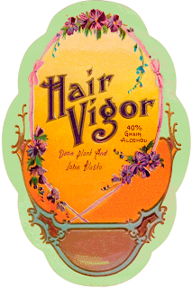
As you may or may not know from my other posts, I started with vintage soap and perfume labels, edited out text, messed with color, and added my own text back in. They were a labor of love. For the invite itself, I was drawn to this label in particular:
Enough explanation, on to the main event!
As you may or may not know from my other posts, I started with vintage soap and perfume labels, edited out text, messed with color, and added my own text back in. They were a labor of love. For the invite itself, I was drawn to this label in particular:
From there, I tweaked the heck out of the colors, until I achieved something like this:
But then, of course, was the issue of wording. I knew I wanted the top to say "Together with our Families" since this is a family effort, and I knew I didn't want proper titles or middle names to imply our casual setting. From there, I came up with the following wording:
For the curious, I alternated Jugend WF and Lullaby. The fancy type for our names and the Shakespeare quote are KellyAnn Gothic.
The quote is from Henry VI (Act 4, Scene 6) by Shakespeare. I enjoy how the quote seems to imply a wedding ceremony if you take it out of context (it's about politics and the fate of the government). So then the tough part was trying to place it all in the invites to create a pleasing aesthetic.
 |
| Looked too sparse in the orange middle section. |
 |
| Better, but I missed having the Shakespeare in there. |
It ended up coming down to the two above, I went with the second one, because I decided we needed to have the address for Mohican on there and not just on the directions card. I had to cut the line "Dinner, a jam session, and merriment to follow." But oh well. You win some, you lose some. I could have spent many more hours tweaking everything, but I'm quite happy with how they turned out.
Just so you know...
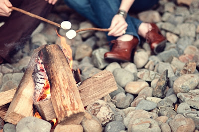
This picture is how I envision our Friday night prewedding S'mores fest to feel:
Jeans, marshmallows, wood fire. I also adore her fabulous oxford heels. I am a sucker for cute oxfords. They have such an old school academic/librarian look to them.
John and I need to figure out what we're going to be doing for our engagement shoot...what to wear, where to go. I'm so uncertain because I've seen so many shoots that are lame (too many random props). I'll have to dig through the files and see what inspires us.
 |
| Seen on Ruffled, photography by Erica Ann |
John and I need to figure out what we're going to be doing for our engagement shoot...what to wear, where to go. I'm so uncertain because I've seen so many shoots that are lame (too many random props). I'll have to dig through the files and see what inspires us.
Saturday, May 7, 2011
Bourbon Tasting
I saw this wonderfully styled small batch bourbon bar here, and was instantly smitten with the pretty crystal decanters and vintage glassware.
Not exactly something I'd do for a wedding, but would be fun for a more informal, cocktail-style party with a few bourbon-aficionado friends.
All photos from here, photography by A Bryan Photo.
Thursday, May 5, 2011
Ceremony vs. Reception Dresses
I don't typically believe in the idea of two dresses. I think it's extravagant to spend so lavishly on two gowns. And, I personally want to stay in my wedding dress as long as possible. As in, I would wear it 24/7 if I could. That's the kind of dress love you don't cheat on by bringing another dress into the picture.
That said, I love this bride's reception dress, a mint green, embroidered Roberto Cavalli. It's stunning!
I would just get married in that! Wow!
That said, I love this bride's reception dress, a mint green, embroidered Roberto Cavalli. It's stunning!
 |
| Seen on StyleMePretty, Photography by John & Joseph Photography |
Photo Love
 |
| Joshua Behan photography, spotted on StyleMePretty |
Monday, May 2, 2011
Lovely Photo of the Day
Love the dress, the action shot, the smiling faces all around. What a great shot!
 |
| Spotted on Snippet & Ink, by R. Wagner Photography |
Subscribe to:
Comments (Atom)


