Wednesday, January 26, 2011

John Galliano goes Hollywood Glamour!

I saw this blog post on the beautiful, classic glamour of the Spring 2011 John Galliano show. I'm not one to follow couture, though I'm fascinated by it. (Fashionated?) 

I love the swanky, 40s look; the bright red lacquered lips, the picture collars, the voluminous skirts. But most of all? I love the sheer, colorful, elbow length gloves.

Good old birdcage veils.
Love the sheer champagne and taupe
with those blue gloves!
Something about this one reminds me
of Grace Kelly...the hair? The slim silhouette?
Favorite.
Love the gloves and the color combo!
Volume!

Stunning.

What.


This image amazes me.

Saturday, January 22, 2011

Flower Power!

John loved the vibrant purples in these flowers,
which inspired the pop of purple in the color scheme.


My Bouquet
I like the soft peachy colors in this one.
The inspiration for my bridal bouquet, only I want to wrap mine in lace
and vintage gold lockets with pictures of my grandparents in them
I love this one <3
LOVE the loose feel and the colors of this one!!!

Bridesmaid Bouquets
I'm thinking more vibrant for the bridesmaids' bouquets,
adding more of the bright purple
More bridesmaid bouquet inspiration!
Love the quirky mix of colors in this one
(and those ferns at the bottom)!
I love the purples and oranges in this group! So pretty!


Groomsmen Boutonnieres
Boutonniere idea; I like the velvet ribbon. I could get it in our colors...
Another idea for the boutonnieres. I want to replicate this look in our colors
with velvet millinery leaves and flowers to match the bridesmaids' fascinators...
And one more pretty picture, for good measure


And, just a beautiful all-around shot. I love her face in profile,
her beautiful expression, and the quirky colors of her bouquet.
The end! 
(...for now)

Wednesday, January 12, 2011

Old Skool Nerdiness

Did you ever have the After Dark screensavers? You know, the people who did the Flying Toasters?

I found a lot of my old favorites on youtube! Man, that takes me back to mid-90s computing. Back when we had a Gateway and I logged on to AIM and sites like Freeopendiary.

Who will win?


I wish I could install the old After Dark software and have these on my computer again...I'll bet we still have the cd, but it's not compatible :(

Tuesday, January 11, 2011

Something Blue

Guess who just bought a little something blue to take away the blues?

(me).


I'm not saying these are my something blue for my wedding...I don't think I'll have any trouble incorporating many little something blues.

I'm reserving jewelry decisions until I find my dress, though there are some heirlooms that are likely to make it into the mix:


My mother's engagement ring, the necklace she wore on her wedding day, and my grandmother's locket with pictures of John and I inside.

Saturday, January 8, 2011

Cake Lust

Just saw this beauty on Once Wed...


Ignoring the fact that it's pink, I love the subtle texture in the icing, the smooth, simplicity, and the small bunch of flowers on top.

The best part? This cake was from Whole Foods!

Thursday, January 6, 2011

Appeasing the Foodie in Me

Saveur released the Saveur 100, a list of great restaurants, foods, and cook's tools from the past year.

Some of my favorites?

Celery Bitters...sounds intriguing; I didn't know they had other flavors of bitters. I am used to the fresh, green, herbal sharpness of Angostura bitters. But they suggest throwing in bitters even in cooking, something I've never considered doing! Here's the whole line of flavored bitters, from chocolate to grapefruit!

This write-up about a tomato sandwich has me longing for summer...

Milk and Honey. Warm up some milk, add a few spoons of honey. Sounds comforting! I might have to try frothing the milk with my new Aerolatte frother (a wonderful Christmas present from John!).

The description of Sushi Shin makes my mouth water.

You know how foodies love to re-invent simple, low-brow dishes (I've seen things like mac and cheese with duck, savory cotton candy flavors, and wasabi ice cream)? This takes the cake: broccoli with Cheetos.

Blis Syrups. The vanilla-infused maple syrup sounds awesome.

Tequila hot sauce? Sounds fun to try!


And, some other links from around the web:

Adorable recipe cards via Etsy.

I made my first lasagne recently, based loosely on this recipe. The sauce was tweaked with handfuls of spinach, but the result was so flavorful and comforting, and there was no meat in it!

John's been on a big Michael Pollan kick (due in part to the fact that I bought him all his books for Christmas). I really enjoyed his snappy Food Rules: An Eater's Manual.

For more direct recipe cards, try "This Doesn't Taste Like Crap" and "Break Out the Fat Pants"

Adorable recipe cards with an Octochef (that's Octopus+Chef)!

A really practical idea, printable recipe cards mean you can add to your stack at any time!

Monday, January 3, 2011

Bridesmaid Dresses

Here's my thoughts on bridesmaid dresses:

  1. I don't want my bridesmaids spending a boatload for a dress (screw you, J. Crew). It's not fair to them to ask them to stand at my side and then have them have to shell out a crap ton of money to do so. If we end up with a dress that's much over $100, I will probably contribute to defray the cost of the dress.
  2. I detest strapless dresses, but almost all the bridesmaids dresses out there are strapless. But I don't want what basically looks like a strapless dress that they threw some spaghetti straps on. It looks sort of dated to me.
  3. I would like cocktail/knee-length, because we'll be outside in August. The sleeveless ones I've looked at are also for this reason, though I wouldn't be opposed to little flutter cap sleeves or something. It's just finding dresses that come in multiple sizes that come in the solid colors we need.
  4. All the dresses I've looked at have pockets. This to me is a huge plus. I know I would want pockets!

These are our colors.
I won't be subjecting my ladies to peach dresses. I'm saving peach for details and paper things. I think my biggest bridesmaid inspiration was via Style Me Pretty, from an inspiration shoot:

via a classic inspiration photo shoot
The giant pearls are a little Wilma Flintstone for me, but I adored the shade and style of the dress, as well as the hairdo. But the dress was custom made, so I had to try to find some alternatives.

Option 1: Alfred Sung D440, in Fresh (minty green), Jade (the deeper blue green), and Paradise (the lighter purple).

This one is nice, because it's classy. It's got that Audrey Hepburn sort of neckline. And pockets. Pockets are pretty much a necessity!

But, how will it look with an *ahem* busty girl? I have no idea. Thoughts?


Option 2: Alfred Sung D447. In Dahlia (the purple), Niagara (teal in the middle), and Seaside (the seafoam). I think this is my favorite, as it is most like the inspiration picture.


Option 3: Alfred Sung D438 in Jade, Fresh, and Paradise. If my ladies didn't mind going strapless. I like these for the a-line skirt and the colors. We could always do a little cover up of some sort...

David's Bridal stuff was mostly tacky. I'm drawn to these Pantone dresses because the prices weren't bad (around $120) and I love the vibrant, saturated colors that fit perfectly in our color scheme.

What do you think? Any favorites?

Overwhelmed by Color Part II

So, when we left off, I was arranging swatches for hours on end. John would look over at my boards and chime in "Green isn't really a wedding color to me," or "I love the combination of purple and orange," or "That board is sort of bland." I really valued his input, especially since most grooms I know of don't give their two cents about this sort of thing.


So these were the top four boards. We loved the purple and orange, but it just didn't feel right for Autumn. Part of me thinks we were destined to have an Autumn wedding, personality-wise, but it just didn't make sense with our academic careers and schedules of our loved ones...

So we let go of the purple/orange board.

Bye, we'll miss you!
Next, I tried to throw in cobalt blue with the creamy, peachy palette. I was inspired by these two boards to try to throw in the true, deep blue.


Pretty, but predictable.
I love the color, but it ultimately felt too safe with all the cream and peach. John even said "It looks too bland. It needs a pop of another bright color to make it work." I think he was right about that.

Remember me?
Next, I went back to the idea of teal and peach. With the first two boards, I felt like I was betraying my engagement ring. Since I picked a teal diamond it's been sort of inevitable that I'd have some form of teal in my wedding colors, to set it off nice.


But it still seemed like something was missing, though we were on the right track.

I kept coming back to the seafoam green with the orange-y peach.
Then John said something that made it click for me "I think you should try it with purple in there somewhere."
The one.
So it's settled. I still get my soft peach/seafoam green, with some graduated bluegreen/teals, and a pop of bright purple. Everybody is happy, and if we stick to orange-y peaches it's almost like having the purple/orange combo.

Now, the fun part. A color scheme alone doesn't make a wedding, though it's a nice start. Out of these colors, I have to figure out what color the bridesmaids should wear and the groomsmen (and me, for that matter; I'm not necessarily sold on a white gown). I have to start making the actual aesthetic decisions.

But it feels like a major milestone! Also, our deposit is paid on our venue, so it is totally, completely booked. Hooray!

Overwhelmed by Color Part I

I feel like Dorothy in the Wizard of Oz; she steps out of her house into a technicolor world. She must have been overwhelmed by the dazzling variety of hues.

John and I have been trying to pick the theme colors for our wedding.

Several things are going into this decision. First, I don't want a typical wedding color palette. I'm a person who grew up with art in my life; I want a vibrant, quirky collection of colors to represent us.

This means no sage green, ivory and chocolate brown. No pink and gold. No red and white. No black and white (way too formal for us, and not colorful enough!). No mustard and gray (the latest trend).

I want an interesting pop of color that people haven't seen everywhere. Martha Stewart has some nice ideas (aqua and poppy, lavender and red), but I still haven't seen anything that fits me. I'm not big on bright red or pastel lavender.

My issue is not only narrowing down colors, but deciding what to put together. I want an interesting mix of saturation in my hues, something that pops with something more subtle. I'm thinking five colors, but that's mostly due to my love of 100 Layer Cake inspiration boards, which always group five colors together.

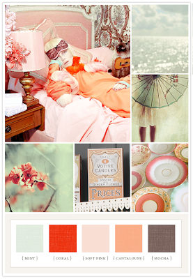
I love the unexpected pops of color.

The first board I ever downloaded.
But the dark orange feels too autumn to me.

I love this one, but didn't love the red
and it just didn't work without red.
So, in a crazy attempt to narrow down colors, I cut and pasted swatches from various 100 Layer Cake boards and arranged them for hours. Literally, hours.


Stay tuned for the thrilling conclusion...and the final decision!