 |
| On EatCakeBeMerry |
Showing posts with label Design. Show all posts
Showing posts with label Design. Show all posts
Wednesday, July 13, 2011
Awesome Cake
It's been a while since a cake caught my eye, but this one was just striking:
Gorgeous!

Tuesday, July 12, 2011
Vintage Book Page Decoration
I recently saw two fabulous photos where brides made use of vintage book pages in their decor, to stunning results.
 |
| Seen on Green Wedding Shoes, photos by Focus Photography |
 |
| Seen on Love and Lavender, photography by Jason and Anna Photography |
Thursday, June 30, 2011
Perfection.
This image sums up a vision of what I want my wedding to feel like:
I love the woodsy feel, mixed with the vintage photographs in gorgeous old frames.
I am currently rounding up old photos of all our sets of grandparents to display somewhere at the reception (possibly at the table with all the escort cards.
Gorgeous!!!
 |
| On Style Me Pretty, photo by Tyler Metcalfe Photography and Greenleaf Images |
I love the woodsy feel, mixed with the vintage photographs in gorgeous old frames.
I am currently rounding up old photos of all our sets of grandparents to display somewhere at the reception (possibly at the table with all the escort cards.
Gorgeous!!!
Superhero Themed Wedding
I friggin' love this wedding. I spotted it a few weeks ago, but have been a bad blogger and haven't yet shared it.
I spotted the wedding on Green Wedding Shoes (which I've really been digging lately), with photography by Jagger Photography.


I spotted the wedding on Green Wedding Shoes (which I've really been digging lately), with photography by Jagger Photography.


Things I love about this wedding:
1) The clever cereal bar and names for the cereals (Cocoa Kryptonite, Mr. Freeze Frosted Flakes)
2) The wonderfully bright, cheerful colors.
3) All of the backdrops for their photos. Amazing!!!
Saturday, May 21, 2011
Formal Invitations Part 3: RSVP Cards
I mentioned RSVPs already in a previous post (and had my French corrected before I made a fool of myself). So I won't rehash it too much. But I did have a second kind of RSVP card, for the jam session. We didn't send one with every invite, just to some of the key players. Hopefully we'll get a good group together and others will let us know if they have some interest in playing with us!
I made two different jam session RSVPs because I just couldn't decide between the two record players. They were both so pretty!

This is what I started with. I initially wanted to just edit out the text and use the book/roses for something in the invite suite, but I couldn't get it to look good.


I also designed two versions of the RSVP; one for single invitees and one for couples. Some people aren't aware of the convention that the names listed on the envelope are all that are invited. If your name is listed singly, than they aren't allowing you to bring a guest. I mentioned this to John, and he said he wasn't aware of that distinction. While some people know this from going to other weddings, others may be like John and unaware that they shouldn't tack on a +1 to their RSVP.
As I mentioned in the invite post, we have a super strict guest limit imposed by our venue. For a friend to bring a guest, an aunt or uncle would have to get axed, so we opted to include only engaged couples and those living together. Basically, we went with examples where we knew both people in the couple well, which in most cases meant they were living together/engaged/had been together for several years so we had gotten to know them anyway.
Hopefully this won't cause too many issues. It really was an attempt at inclusion, not exclusion: trying to bring together those that know us well and mean the most to us. If we don't know your girlfriend or boyfriend, chances are they won't know many of the other guests either.


I still have doubts. Should I have had a place to put a number on the multiple invites? How will people let me know if only one of them is coming? I know it will be fine and I can always just call somebody if I am confused, but I suppose a little stress about the RSVPs is normal, right? I just want to get a clear sense of who will be there!
Friday, May 20, 2011
Formal Invitations Part 2: Directions to Mohican
My dad is the one who suggested we include directions to Mohican in the invitation. I figured most people have GPS in their cars now and can punch in the address, but I also know that some of the roads are a little confusing right as you get close to the park, so I decided to go for it.
I wanted something that was a similar shape and would pair well with my unusual-shaped invites:


Perfect! But the pink had to go. Ugh.


I wanted something that was a similar shape and would pair well with my unusual-shaped invites:


Perfect! But the pink had to go. Ugh.


I ultimately went with the peach/mint combo. From there the directions cards came together much more easily than the invites. Since I didn't have a ton of room to put turn-by-turn directions, I uploaded a more thorough version to the website for further reference. Or, people can input the address into their GPS and use our directions more as a guide.

Formal Invitations Part 1
I wasn't blogging much in the last two weeks, because I was in crunch time to get my invites finished and sent. Round 1 is out, and I'm already receiving enthusiastic responses back (hooray!). Round 2 will go out if/when we get some people declining. There were so many people we loved and wanted to include, but we have really strict limitations on space for our venue, and are held fast to exactly 150 invitees. I hope they understand that they aren't necessarily second-fiddle in our eyes, we just have giant families!
Enough explanation, on to the main event!
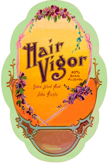
As you may or may not know from my other posts, I started with vintage soap and perfume labels, edited out text, messed with color, and added my own text back in. They were a labor of love. For the invite itself, I was drawn to this label in particular:


Enough explanation, on to the main event!
As you may or may not know from my other posts, I started with vintage soap and perfume labels, edited out text, messed with color, and added my own text back in. They were a labor of love. For the invite itself, I was drawn to this label in particular:

From there, I tweaked the heck out of the colors, until I achieved something like this:

But then, of course, was the issue of wording. I knew I wanted the top to say "Together with our Families" since this is a family effort, and I knew I didn't want proper titles or middle names to imply our casual setting. From there, I came up with the following wording:
For the curious, I alternated Jugend WF and Lullaby. The fancy type for our names and the Shakespeare quote are KellyAnn Gothic.
The quote is from Henry VI (Act 4, Scene 6) by Shakespeare. I enjoy how the quote seems to imply a wedding ceremony if you take it out of context (it's about politics and the fate of the government). So then the tough part was trying to place it all in the invites to create a pleasing aesthetic.
 |
| Looked too sparse in the orange middle section. |
 |
| Better, but I missed having the Shakespeare in there. |


It ended up coming down to the two above, I went with the second one, because I decided we needed to have the address for Mohican on there and not just on the directions card. I had to cut the line "Dinner, a jam session, and merriment to follow." But oh well. You win some, you lose some. I could have spent many more hours tweaking everything, but I'm quite happy with how they turned out.
Saturday, May 7, 2011
Bourbon Tasting
I saw this wonderfully styled small batch bourbon bar here, and was instantly smitten with the pretty crystal decanters and vintage glassware.
Not exactly something I'd do for a wedding, but would be fun for a more informal, cocktail-style party with a few bourbon-aficionado friends.


All photos from here, photography by A Bryan Photo.
Thursday, April 28, 2011
Amen!
Just go read it, especially if you're a fellow bride. Offbeat Bride writes a wonderful denouncement of the word "tacky"
Brides all over wedding websites worry that their nontraditional wedding will be "tacky." But this term is so meaningless because it's all about context. Just as I know I could never hold a 300 guest soiree in a ballroom downtown with 6 foot tall centerpieces and an all white cake and Canon in D to walk down the aisle...lots of brides do just that. Most of the weddings I play have most of those elements. And you know what? As much as my quartet will occasionally judge (we love silently judging the guests who wear too-short minidresses with spindly little stripper heels), we mostly celebrate what was beautiful: the bride beaming as she walks down the aisle, the groom tearing up during the vows.
I just wish I had given myself a little less grief when I was searching for my wedding dress and getting so upset because I felt like a "bad bride." The wedding industry is sneaky, and very very good at making you feel like you have to do things a certain way. This article is a reminder that nobody is a bad bride. If you want to cosplay at your wedding as elves from the Lord of the Rings, and have your wedding bands engraved with "One ring to rule them all...in holy matrimony," go for it. The people who love you will likely see these ideas as so unmistakably you, and they will love you all the more for expressing yourselves in your wedding planning.
Brides all over wedding websites worry that their nontraditional wedding will be "tacky." But this term is so meaningless because it's all about context. Just as I know I could never hold a 300 guest soiree in a ballroom downtown with 6 foot tall centerpieces and an all white cake and Canon in D to walk down the aisle...lots of brides do just that. Most of the weddings I play have most of those elements. And you know what? As much as my quartet will occasionally judge (we love silently judging the guests who wear too-short minidresses with spindly little stripper heels), we mostly celebrate what was beautiful: the bride beaming as she walks down the aisle, the groom tearing up during the vows.
I just wish I had given myself a little less grief when I was searching for my wedding dress and getting so upset because I felt like a "bad bride." The wedding industry is sneaky, and very very good at making you feel like you have to do things a certain way. This article is a reminder that nobody is a bad bride. If you want to cosplay at your wedding as elves from the Lord of the Rings, and have your wedding bands engraved with "One ring to rule them all...in holy matrimony," go for it. The people who love you will likely see these ideas as so unmistakably you, and they will love you all the more for expressing yourselves in your wedding planning.
Thursday, April 21, 2011
Hand-drawn invite love
 |
| The groom hand-drew details from their entire relationship I love how the response card is tucked in with photo corners!!! |
 |
| Above the outgoing address, it said "Dear Postman, warmly deliver this tender parcel to our fine guests." LOVE. |
Sunday, April 17, 2011
Invite Suite: RSVP Cards
In deciding to design and print my own invites, I knew it would be a lot of work, but I didn't expect the process I have gone through (the countless hours, and I'm not even done yet!). Case in point: the RSVP cards. Just a simple little card with which to reply and tell us you're coming, right?
Well, you know me. I have about 3 different designs mocked up with multiple fonts. You have to play around to see what works (or, at least, I do, since I'm not a trained graphic designer and I need to see different combinations to know what will look best).
Here is one such version. This was the starting point, a vintage french soap label with the text removed.


...And several versions later, it was getting frustrating. I then decided the images needed something even more visual, so I thought putting a little divider or image between the two sections would help:


They're definitely cute. But the diamond seems a little out of place with the rest of the image. So then I went for background images, which consisted of three steps:
1) Dig up my old letterpress image files from briarpress.org
2) Open them up individually in GIMP (freeware photoshop-type program), add an alpha channel, select all the white in the image, then clear to make a transparent background.
3) Add the transparent image as a new layer to the RSVP card, and edit the opacity of the image to make it lighter and put it behind the text.
The result of all this was that I ended up with two that I liked:


Well, you know me. I have about 3 different designs mocked up with multiple fonts. You have to play around to see what works (or, at least, I do, since I'm not a trained graphic designer and I need to see different combinations to know what will look best).
Here is one such version. This was the starting point, a vintage french soap label with the text removed.

Which I then took and made a "backside" which extended the open space for text:

Then I had to settle on RSVP wording. I don't want to simply have a "yes" and "no," so I looked up all sorts of different ways to word the card. Some were overly cutesy ("I'll be there with bells on" and "Can't make it, but heard there will be people wearing bells"), some were silly ("I'll be there come rain or come shine!" "Sorry, out of umbrellas and sunscreen.") and others were stupid (many of them).
Since the wedding is so vintage themed, I wanted something classic without being boring, and a little elegant. I settled on using "in body" for yes and "in spirit" for no. I like it.
So, then it was time to play with fonts.


They're definitely cute. But the diamond seems a little out of place with the rest of the image. So then I went for background images, which consisted of three steps:
1) Dig up my old letterpress image files from briarpress.org
2) Open them up individually in GIMP (freeware photoshop-type program), add an alpha channel, select all the white in the image, then clear to make a transparent background.
3) Add the transparent image as a new layer to the RSVP card, and edit the opacity of the image to make it lighter and put it behind the text.
The result of all this was that I ended up with two that I liked:


What do you think? I think both are pretty great, it's just tough deciding. Perhaps once the other pieces fall into place, one will look better with the other elements.
I know it's weird to design such a small part of the paper goods first, but I was just drawn to this image and it screamed RSVP card to me for some reason. I couldn't tell you why. This isn't to say these are the RSVP cards, end of story. By the time the invites are done I might go with something completely different.
Note to all fellow brides: DIY IS HARD. Just so you know. I am undertaking all this because I am stubborn and it's a labor of love, but don't think it isn't insane of me.
Wednesday, December 15, 2010
Diamonds are A) forever B) a girl's best friend C) dead
I recently saw Charlize Theron's J'Adore Dior ad again and remembered that I loved it. There's something so incredible about the entire scene; she looks fabulous in her jewels and dress, but even more fabulous as she's tossing it all aside.


I love the lines "Gold is cold. Diamonds are dead."
Speaking of diamonds, how the hell did they become the stone of choice for engagement rings? Yes, yes, I know you know about DeBeers manufacturing demand by making them seem scarce, but how did they get into engagement rings, specifically? Mental_Floss had an interesting article on the subject.
My favorite quote came from a DeBeers chairman: "Diamonds are intrinsically worthless, except for the deep psychological need they fill."
I am not about to judge this choice. I ended up with a diamond, albeit a teal one.
Gosh, it's pretty.
Anyways, I think diamonds may have been a popular choice for rings even without the marketing and creation-of-demand by the diamond industry. Diamonds are, after all, the hardest gem, and therefore the most durable. The phrase "a diamond is forever" is catchy but also descriptive. After all, we've gravitated towards platinum for the metal because it's so strong and durable.
I would have loved an opal ring, as it's one of my favorite stones. But, opal shatters easily. Very easily. And, the older opals get, the more the water leeches out of the stones, leaving them dull. The whole beauty of opals are their fragility, the water content radiating colors from within.
Plus, diamonds are sparkley when they're cut well. I'll never understand why raw diamonds are such a big deal on etsy, or the rose-cut ones. I love the look of a rose-cut stone in a bezel setting, but why spend so much for a diamond? Why not just get a rose-cut quartz or other stone? Most of the sparkle is gone from a stone like that.
I almost had a sapphire engagement ring, until Kate Szabone (my awesome jeweler) sent me pictures of different stones she had in stock. As soon as that little oval teal diamond showed up in my life, there was no going back. I distinctly remember a conversation with my maid of honor while I was trying to decide on a stone where she said "You already know you want that one. You keep coming back to it."
It's true. That magnetic attraction has only intensified since being proposed to. I still love looking down at the ring in different lights to see how the diamond looks. Sometimes it seems inky blue, other times it seems more green than blue. It looks best under stage lights and early morning light. It looks best on my hand where I can admire it. It reminds me of John and how much he loves me.
That's the whole point of the engagement ring.
Y'all can have your white diamonds. They are pretty, and I don't blame you one bit for wanting one (as long as you get a conflict-free diamond, of course). But mine is purely, perfectly me, and for that reason it is the best ring in the whole world. I will never see one I want more than the one already on my hand, which was custom made to my exact specifications, from the bezel setting to the sideways setting of the stone to the grooved, whisper-thin band so that I could still play violin with it on.


I love the lines "Gold is cold. Diamonds are dead."
Speaking of diamonds, how the hell did they become the stone of choice for engagement rings? Yes, yes, I know you know about DeBeers manufacturing demand by making them seem scarce, but how did they get into engagement rings, specifically? Mental_Floss had an interesting article on the subject.
My favorite quote came from a DeBeers chairman: "Diamonds are intrinsically worthless, except for the deep psychological need they fill."
I am not about to judge this choice. I ended up with a diamond, albeit a teal one.
 |
| Hi there, engagement ring! I love you! |
Anyways, I think diamonds may have been a popular choice for rings even without the marketing and creation-of-demand by the diamond industry. Diamonds are, after all, the hardest gem, and therefore the most durable. The phrase "a diamond is forever" is catchy but also descriptive. After all, we've gravitated towards platinum for the metal because it's so strong and durable.
I would have loved an opal ring, as it's one of my favorite stones. But, opal shatters easily. Very easily. And, the older opals get, the more the water leeches out of the stones, leaving them dull. The whole beauty of opals are their fragility, the water content radiating colors from within.
Plus, diamonds are sparkley when they're cut well. I'll never understand why raw diamonds are such a big deal on etsy, or the rose-cut ones. I love the look of a rose-cut stone in a bezel setting, but why spend so much for a diamond? Why not just get a rose-cut quartz or other stone? Most of the sparkle is gone from a stone like that.
I almost had a sapphire engagement ring, until Kate Szabone (my awesome jeweler) sent me pictures of different stones she had in stock. As soon as that little oval teal diamond showed up in my life, there was no going back. I distinctly remember a conversation with my maid of honor while I was trying to decide on a stone where she said "You already know you want that one. You keep coming back to it."
It's true. That magnetic attraction has only intensified since being proposed to. I still love looking down at the ring in different lights to see how the diamond looks. Sometimes it seems inky blue, other times it seems more green than blue. It looks best under stage lights and early morning light. It looks best on my hand where I can admire it. It reminds me of John and how much he loves me.
That's the whole point of the engagement ring.
Y'all can have your white diamonds. They are pretty, and I don't blame you one bit for wanting one (as long as you get a conflict-free diamond, of course). But mine is purely, perfectly me, and for that reason it is the best ring in the whole world. I will never see one I want more than the one already on my hand, which was custom made to my exact specifications, from the bezel setting to the sideways setting of the stone to the grooved, whisper-thin band so that I could still play violin with it on.
Only in Vogue...
...do you see people frolicking in soap suds in couture. I love the look of the models, but I think the setting is silly. As if we all go to the laundromat looking like that.
Perhaps it was just this particular shoot that didn't work for me. Generally I like seeing the juxtaposition of the fantastical with the mundane. And I do like the models and their clothes...
Perhaps it was just this particular shoot that didn't work for me. Generally I like seeing the juxtaposition of the fantastical with the mundane. And I do like the models and their clothes...
 |
| Ruffles! |
 |
| My favorite shot. Love that dress and her pose! |
 |
| Love this dress! |
Subscribe to:
Posts (Atom)